MongoDB Charts Integration
Overview
This document describes how to leverage MongoDB Charts visualizations within Qarbine templates and to also provide interactive drill downs from those charts into other Qarbine analyses showing the details behind the summary visualizations.
MongoDB has extensive documentation on how to use and embed its Charts visualization functionality. One of the Charts tutorials involves charting sales data using the available sample data. That link is at
https://docs.mongodb.com/charts/master/tutorial/order-data/order-data-tutorial-overview/
A sample resulting dashboard is shown below.
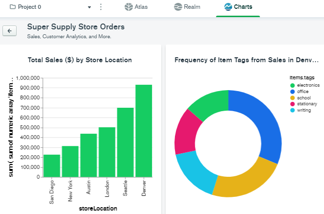
The first chart shows the total sales by store location over the complete data set. The task is now to provide the background details for a particular store location. In addition, for this example data set, we are only going to analyze the year 2013.
Important Note
The use of this custom cell is dependent on stable MongoDB’s Chart integration JavaScript libraries which are subject to change. Consider using the Qarbine native chart.js custom cell to avoid potential “breaking changes” to templates.
Creating an Analysis Containing a Chart
Open up MongoDB Atlas® Charts
Navigate to your Charts page area.
Locate the chart of interest and note the button highlighted below.
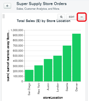
Choose “Embed Chart”
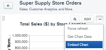
Note when you try to use sample data you will receive the following message.

For your own data, the following is expected.

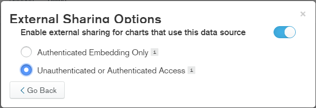
Click “Configure external sharing”. The following is shown.
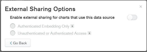
In this example we are going to use unauthenticated access. Click the upper right toggle and then the bottom radio button as shown below.
Click
The following will appear.

Click the right hand toggle.
Choose Javascript SDK
Keep this tab open.
Within the Qarbine Template Designer
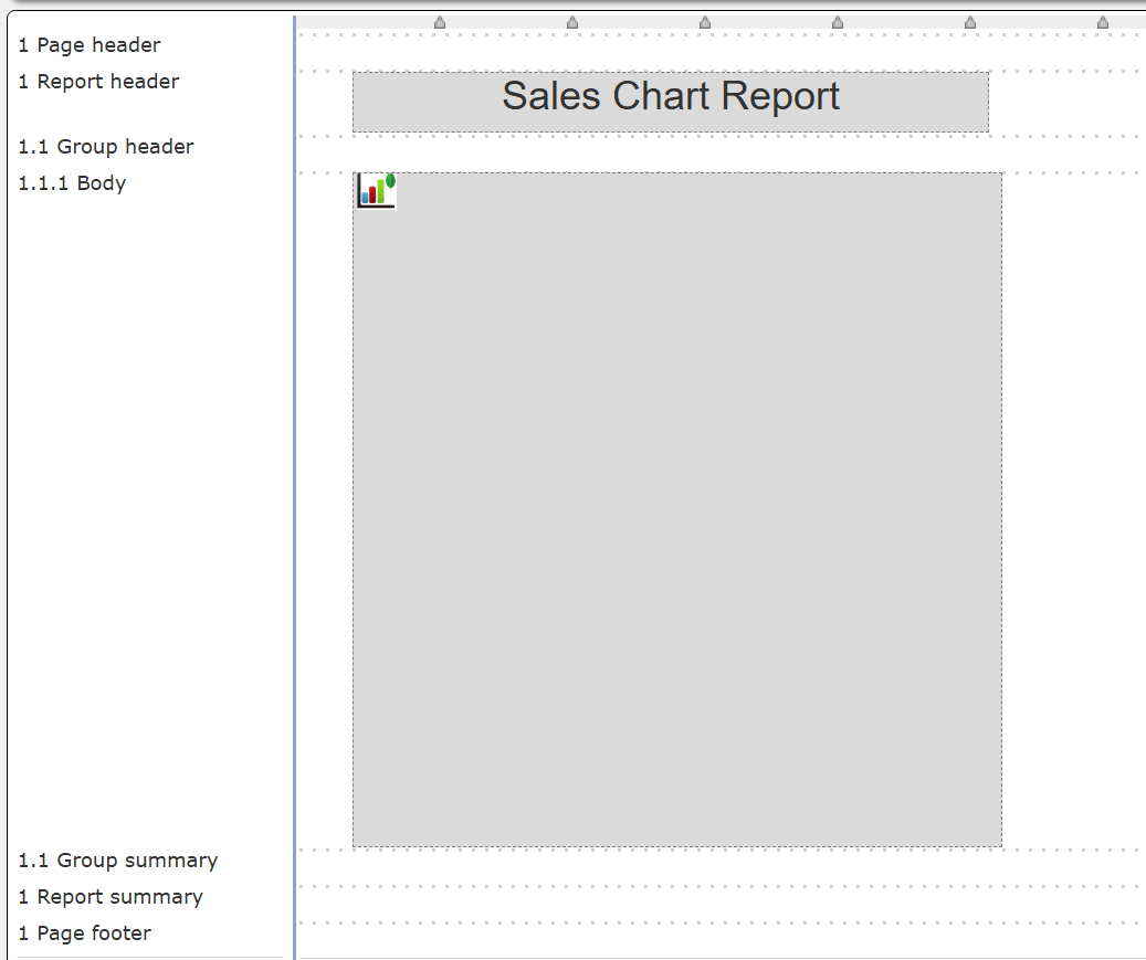
Start a new template. There is a new one whenever the Template Designer is just opened from the sign on page or from the hamburger icon in the upper left of Qarbine tools. In your template, click where you would like the upper left of the chart to reside. It is the yellow rectangle in the picture below “Sales Chart Report”.

On the right hand side, choose “Show custom cells”.
Scroll down to select “MongoDB Chart”.
Add the cell by clicking
The default vertical spacing and width have been allocated and the cell selected. There is some general guidance on the use of the custom cell on the right side as well.

Switch back to your Charts tab
In the bottom area, copy the Charts Base URL value by clicking the copy button
****
Switch back to the Template Designer
In the right hand side of the page paste the value into the “Charts Base URL” field. The value should be enclosed within the double quotes.
The default height behavior is to occupy 4 inches (288 points) of vertical space on the line. Edit the line height as desired. You can adjust the width in the top toolbar area as well.
Switch back to your Charts tab
Next, copy the Chart ID by clicking its copy button.
Switch back to the Qarbine Template Designer tab
Click in the formula entry field and press control-A to select all.
Now within double quotes, paste the clipboard into the formula area as shown below and then press the tab key.
Note- How the cell’s vertical space is used is related to its line’s properties. You can allocate an amount of space for the line and an overall amount of space for the chart. The result is a paragraph like behavior allowing the chart to bleed into rows below it within the same section.
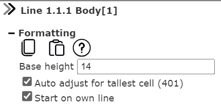
The Template Designer content is similar to what is shown below.
Every Report Template requires a main set of data. For simplicity, you can use the following steps in this example.
Click on the properties icon as highlighted below.
In the properties dialog adjust the Main Data as shown below.

Since the goal of the template is to show the MongoDB chart, the simple “listWith(1)” formula is used to go through the body section once.
Run the Template
To execute the report, click
You will see the report result page and any MongoDB Charts loading feedback as well,
Below is an example result.
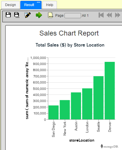
Congratulations, you have defined a report template containing a MongoDB Chart.
Interactive Charts and Detail Report Drill Downs
A logical next step is to drill down into a particular store to see order details. This will be accomplished using a Qarbine Report Template which accepts a store location from the embedded MongoDB chart to drive its operation.
Defining the Qarbine Data Source
First, define the Qarbine Data Source (not a Charts’ “Data Source”). We can start by defining a query using a hard coded store location to make sure the query retrieves what we want.
Open the Qarbine Data Source Designer. Choose your data service which has the information on how to reach your MongoDB data. Next, choose the database within that mongoDB server containing the data as shown below.

The aggregation query is
db.sales.aggregate( [
{$match:  {storeLocation: "London",
       "saleDate":{"$gte": ISODate('2013-01-01T00:00:00Z'),
"$lte": ISODate('2013-12-31T23:59:59Z')} }  },
 { "$addFields": {  "orderValue": {  "$sum": "$items.price"  }  }  },
{ $project: {_id:1, saleDate: 1, "customer.email": 1, couponUsed: 1, orderValue: 1, purchaseMethod: 1} },
{ $sort: { saleDate: 1} }
] )
During initial query formation it is suggested to use a limit clause. In addition you can set the number of documents returned by the Qarbine backend. The former is more efficient but requires an explicit limit clause which must later be removed in most circumstances. This is done by clicking the image noted in red . When active you will see feedback on the toolbar such as
.
Note also that if you require dates referenced in your query to be displayed as UTC based, check the box noted below. The example sales data uses UTC dates so this box is checked.
Note- Dates are normally displayed as user timezone dates. If dates are stored in the database as UTC and should remain as UTC for display purposes, then use the utcToLocal(aDate) first so that when the normal date adjustment occurs the result will be shown formatted as UTC.
Running this shows sample document results.

A sample right hand side content is shown below.
Recall the projection reduced the number of fields for each document in the answer set.
Once you are satisfied with your query the next step is to edit it to accept runtime variables. An example would be the following change,
db.sales.aggregate( [
{$match:
    {storeLocation: @storeLocation,
     "saleDate": [! inYearCriteria(@year) !]  }
},
  { "$addFields": { "orderValue": { "$sum": "$items.price" } } },
{ $project: {_id:0, saleDate: 1, "customer.email": 1, couponUsed: 1, orderValue: 1, purchaseMethod: 1} },
{ $sort: { saleDate: 1} }
] )
There are 2 variables in the query specification: storeLocation and year. Running this at this point will show a dialog for the variables.
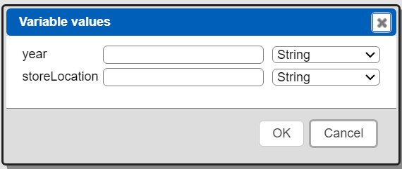
Enter some values and adjust their data types as shown below.

Click
This runs the retrieval and shows the results.
Save the data source by clicking
Navigate to the target catalog folder.
Fill in a name and description.
Click
The component is now saved in the catalog.
Defining a Prompt
An example of this prompt can be found at “example/MongoDB/Store sales/Which Store with dynamic list”.
The variables above can be obtained using a Qarbine prompt. In our charts analysis these parameters will be passed in and no prompt is needed to obtain the values.
Our prompt has the following widgets.

The dialog presented looks like the following.
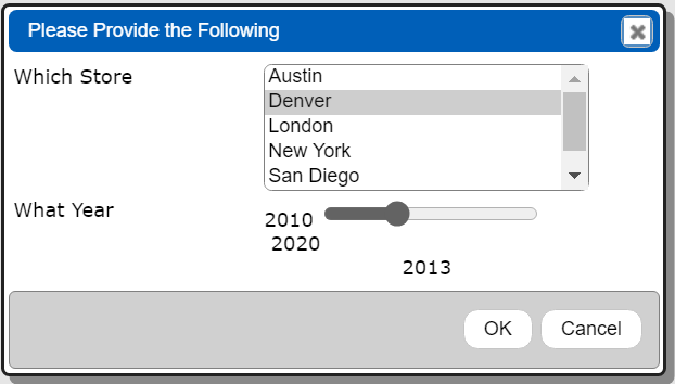
The main properties for the first element are shown below.
The main properties for the second element are shown below.
Save the prompt by clicking
Navigate to the target catalog folder.
Fill in a name and description.
Click
The prompt component is now saved in the catalog.
Referencing the Prompt from the Data Source
In a Data Source Designer open your previously defined component by accessing the recents list. Do this by clicking

Select the component
Click
The component is loaded. Next, open the properties by clicking
Choose the Prompt tab and click

In the recent prompts list choose your prompt.
Click
Close the properties dialog by clicking
Save the updated data source by clicking
When you run the data source the prompt dialog requests values which are then used in the query specification.
An example of this data source can be found at “example/MongoDB/Store sales/Sales in @storeLocation for the year @year”.
Defining the Drill Down Report Template
Start by opening the Template Designer. The example can be found at “example/MongoDB/Store sales/Sales in @storeLocation for the year @year”.
Click the properties icon.
Enter a name and optionally a description. For this we just happen to use the same name as the data source.

Click the “Recent data sources” button noted below.

Select the data source.
Click
The Main Data area now looks similar to the following.

To close the properties dialog click
The template definition area currently has no cells defined. However, the right hand area now has been populated with schema information from the main query.
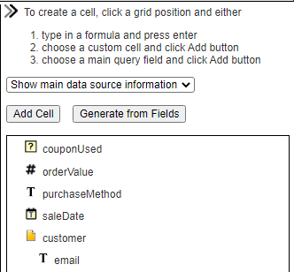
We will now define the template cells. Click on the body line.
Since the sale dates are UTC and our timezone may not be UTC the formula we’ll use is below.
= utcToLocal(#saleDate)
Use the following formatting specification.
For the customer email cell, select the email field in the right hand area and then click “Add Cell”. The resulting formula, which uses dot path notation, is
= #customer.email
which is equivalent to
=@current.customer.email
You can adjust the default width by entering a number in the width entry field as shown below.
Continue these steps for the other fields after which you have something similar to the following.
The orderValue is a currency so click the “$” button in the toolbar and also right justify the value. The upper toolbar now includes the following
Next we will add some headers. Click on the group header line above a body cell. In the formula entry field enter heading text and press enter. Do this for each of the corresponding body cells. You can right justify the “Value” heading and nudge its position rightward to align with the order value output on the body line. The two lines now look similar to the following.

Note if you have any special characters or spaces in your labels then enclose them in double quotes.
Click the run icon highlighted below.
Since the data source has a prompt reference the prompt is presented.
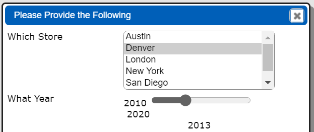
Continuing running the template by clicking
The report will run and the result will be presented.
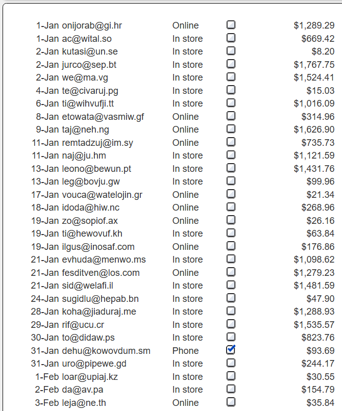
From here further formatting and other refinement can be done. For example, we can group the sales by month, count the number of sales per month, and sum the amount of sales per month.These cells use common Excel-like formulas that you are likely already familiar with.
You can bold text, add borders, and use the boolean custom cell to show a green check mark when a coupon was used. Below is a sample result.
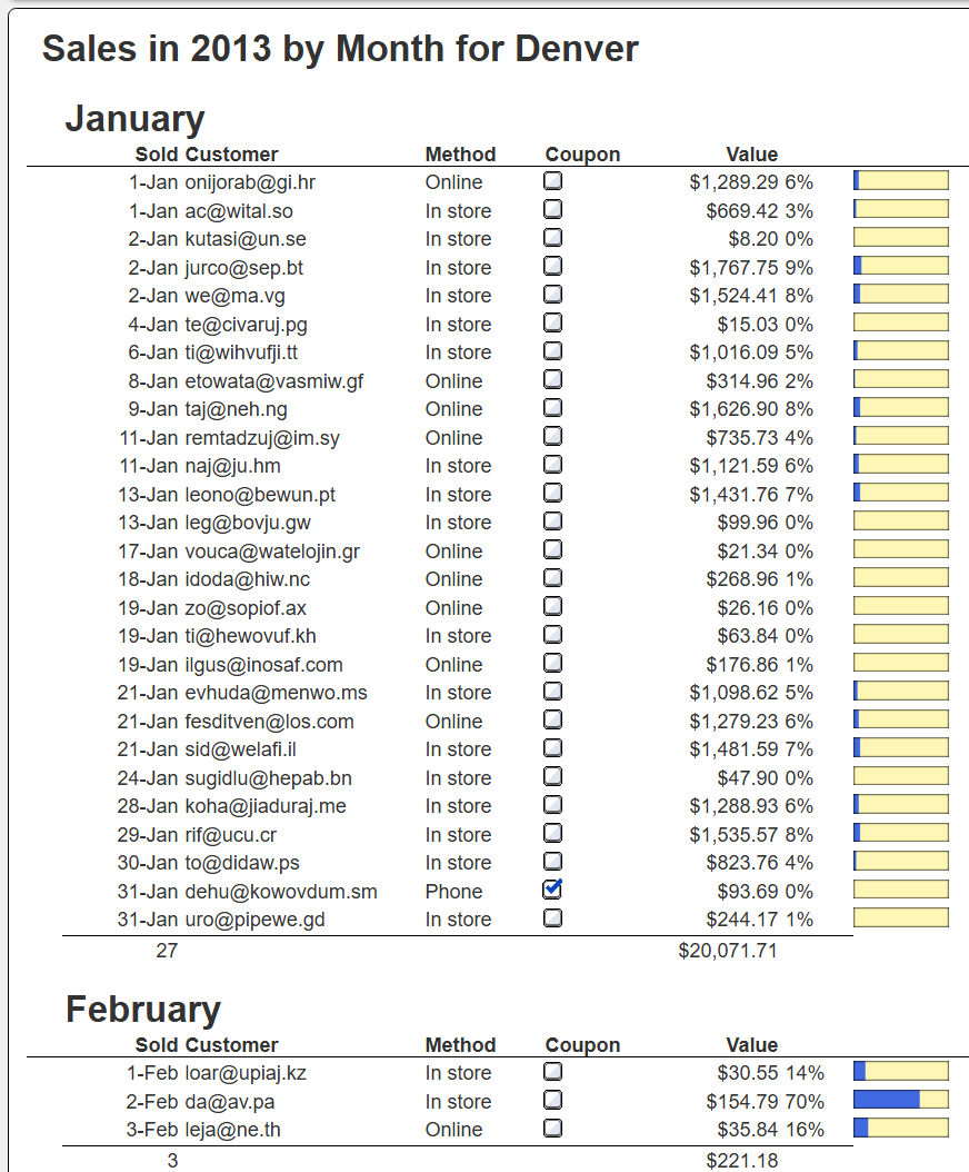
We can also add a grand total for the year as well.
This example can be found at “example/MongoDB/Store sales/Sales in @storeLocation for the year @year”.
Defining the Drill Down from the Chart
We will now glue the chart visualization template and the detailed sales templates together. This is done by using a drill down action from the first template’s embedded chart to open the second template and pass it the clicked upon store location.
Open the first template and select the MongoDB Chart custom cell.
We are going to define a pop up menu for drill down options of the selected bar. In the right hand area, click on the icon noted below.
In the presented dialog.
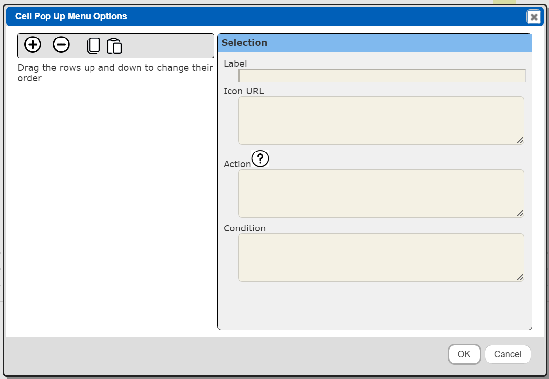
Click
The following is shown.

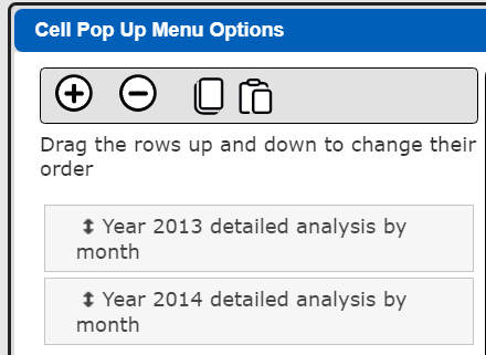
Enter a label for the menu option “Year 2013 detailed analysis by month”.
Enter the menu option action,
componentAction("run", "ReportTemplate`q_catalog|qf_example/MongoDB/Store sales/Sales in @storeLocation for the year @year", null, null, "storeLocation", "@aboutClick.selectionFilter.storeLocation","year", 2013, "bypassPrompt", true)
This specifies to run the report template named “Sales in @storeLocation for the year @year” in the given fully qualified path and pass it variable values for the storeLocation and year. These store location value is obtained from the Chart’s selection filter object as part of the click context.
There is a similar option for the year 2014.
componentAction("run", "ReportTemplate`q_catalog|qf_example/MongoDB/Store sales/Sales in @storeLocation for the year @year", null, null, "storeLocation", "@aboutClick.selectionFilter.storeLocation","year", 2014, "bypassPrompt", true)
The pop up menu dialog looks similar to the following.
Click OK to close the dialog.
The Template Designer’s right hand area now displays the menu labels below the “...” button.
Save the template by clicking
This example can be found at “example/MongoDB/Sample embedded MongoDB Chart”.
Running the Pieces
Run the first report which contains the MongoDB chart.
Next, mouse over one of the bars.
CONTROL-left click and the Qarbine pop up menu for the cell will be shown.
Choose the first option.
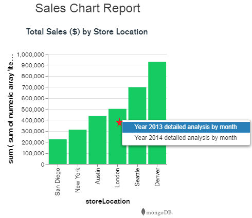
A new tab will be added to the Template Designer.
The report begins running for the chosen store location.
The analysis for the chosen store location is then shown.
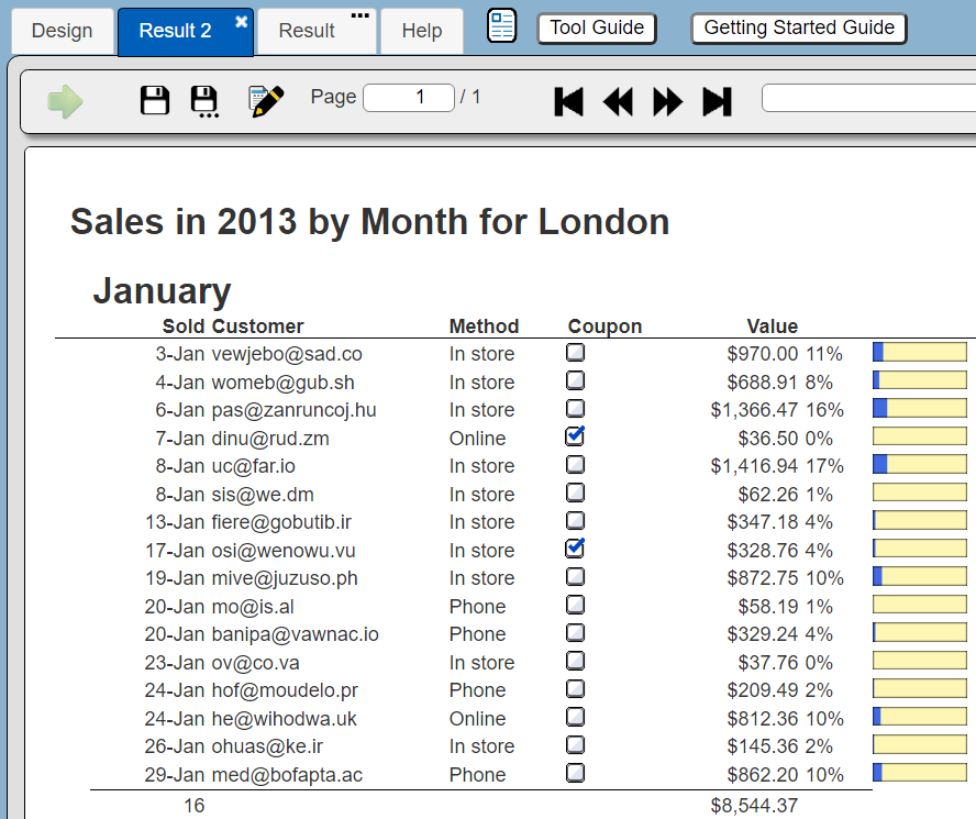
Congratulations, you now have a set of interactive drill down reports.
Interactions Across Templates and Charts
Note that a template can have pop up menus to other templates as well. You can define an interaction to see another report associated with the Denver location, a particular order, or even a particular customer.
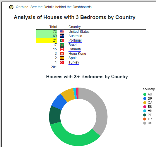
Below is an example of a summary report which includes a MongoDB Chart as well. Both the chart’s arc and the country links can drill into the same detailed report.
Considerations
The MongoDB Chart must be rendered within a web browser for its image to be subsequently saved and exportable into a PDF or other document.
References
For more information on interactive Charts see https://www.mongodb.com/docs/charts/handle-click-events/